blau

How is a typeface developed? When some colleagues and the internet told me that the best way of learning that is by just doing it, I decided to give it a go and design my very own typeface. To ensure steady motivation throughout the process, I set this as the goal of my Bachelor Thesis. Therefore, I could also have an offical mentor who would help me do something which I knew nothing about. Luckily, Wolfgang Homola, a great type designer based in Vienna, agreed to take on this role and taught me a lot about type design.

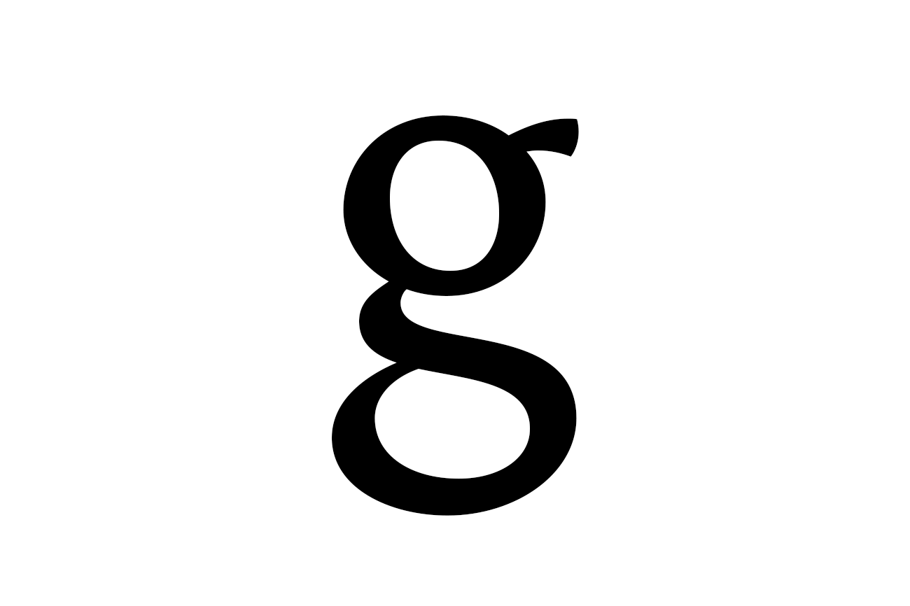
My aim was to create a harmonic serif typeface, which is not only highly legible, but also optimised for small type size and long texts. As I was only a beginner, I focused on balanced rhythm and legibility rather than a unique personality of the typeface. After learning some basic principles, I started sketching the letter “a” and had to find out that it was already difficult to create a letter that didn’t look as if it had drunk too much the other night. I discovered that this was easiest using Copic markers, but it still took me countless tries until I finally managed to draw some decent letters.

The next step was to add “n” and “o”, which are not as characteristic as “a”, but rather indicate the proportions and the stylistic direction of the typeface. Again it proved difficult to draw them, but I soon established a routine that made my workflow more efficient. Having drawn the letters at an x-height of 3cm, I then enlarged them to 5cm with the copying machine and could now refine details by working on transparent paper and then filled the outlined shapes again. This process went on with more letters (if necessary, I repeated a few steps more often), until I had a considerable amount of characters for each of the three stylistic directions I had been pursuing.


At this point I had to choose the style I wanted to continue working on: I decided to go for the punchiest one, carefully finalized its sketches and digitalised them, which meant scanning and redrawing the shapes in the font-editing programme “Glyphs”. Once again, it took me some time to come up with a routine that let me change single parameters, test them and therefore slowly achieve a consistent type face.
I also devoted a lot of time to finding a good spacing because it is no less important than the shapes themselves, but as we don’t really consider that in our everyday life (e.g. when we learn how to write in school), it was a rather new and difficult task for me.

When the lower case letters were finished, I tackled the upper case letters: Here it was most important to achieve well-balanced proportions, which I could test much more easily with the computer than I would have with hand-drawn sketches. I could then bring the initially static letters to life by enlarging the serifs and curving the stems a bit. Finally, I added some essential punctuation glyphs, kerned the most important pairs and assembled some ligatures.

The thesis itself consists of a documentation of the process and a theoretical part, in which the basics of type design are presented in a compact way. Although the typeface is nowhere near ready for purchase yet, I am quite proud of the result I could achieve within three months!

- category: type design
- mentor: Wolfgang Homola
- FH Joanneum, summer 2015